In brief
- We checked 250 Australian small business websites. 229 answered, and every number below is out of those 229.
- 87% had at least one automated accessibility violation. The median site had 8.
- 89% had at least one tap target smaller than the 24 by 24 CSS pixels that WCAG 2.2 asks for at level AA.
- A clean automated scan is not a pass: of the 29 sites that returned zero violations, 24 still had undersized targets.
- Exactly 1 site of 229 passed all 4 of the cheap checks we ran.
What WCAG 2.2 added to the Web Content Accessibility Guidelines
The Web Content Accessibility Guidelines are published by the W3C, and the current version is WCAG 2.2. The WCAG 2 family is the reference almost every web accessibility conversation ends up at, whoever started it. Nothing from the previous version was softened. As the W3C’s What’s New in WCAG 2.2 page puts it, ‘WCAG 2.2 provides 9 additional success criteria since WCAG 2.1’. The only removal is 4.1.1 Parsing, which ‘is obsolete and removed from WCAG 2.2’.
Of those 9 new success criteria, these reach an ordinary business website:
- 2.4.11 Focus Not Obscured (Minimum), level AA. ‘When a user interface component receives keyboard focus, the component is not entirely hidden due to author-created content.’ In practice: a sticky header or a cookie bar must not sit on top of the thing you just tabbed to.
- 2.5.7 Dragging Movements, level AA. ‘All functionality that uses a dragging movement for operation can be achieved by a single pointer without dragging’, unless dragging is essential. In practice: a slider you can only drag needs arrows too.
- 2.5.8 Target Size (Minimum), level AA. ‘The size of the target for pointer inputs is at least 24 by 24 CSS pixels’, with exceptions covered below. In practice: the small icons and slider dots on your mobile layout.
- 3.2.6 Consistent Help, level A. Where help mechanisms such as ‘Human contact details’ or a ‘Self-help option’ repeat across pages, they ‘occur in the same order relative to other page content’. In practice: do not move the phone number around between pages.
- 3.3.7 Redundant Entry, level A. Information already given ‘is either: auto-populated, or available for the user to select’. This one mostly lands on checkouts and multi-step forms.
- 3.3.8 Accessible Authentication (Minimum), level AA. ‘A cognitive function test (such as remembering a password or solving a puzzle) is not required for any step in an authentication process’ unless there is an alternative. This one lands on logins, so a brochure site rarely meets it at all.
The last 2 are out of reach for most small business sites, because there is nothing to log into and nothing to re-enter. The first 4 are not.
How we audited 250 websites for WCAG 2.2 conformance, and what the audit cannot see
We took 250 Australian small business websites, drawn with a fixed seed from 3,897 domains collected from public business listings. The sample leans to trades and construction: electricians, plumbers, roofers, builders, air conditioning contractors.
229 of them answered with a usable page. The other 21 did not: 10 refused the connection, 7 returned 404, and one each timed out or returned 403, 409 and 500. Every percentage below is out of 229.
Each site got 2 passes on one web page, its home page:
- An automated pass with axe-core 4.10, running the WCAG 2.0, 2.1 and 2.2 rule sets at levels A and AA.
- A manual pass at a 390 pixel wide mobile viewport, counting pointer targets smaller than 24 by 24 CSS pixels. Hidden elements, zero-size elements and anything under 4 pixels were excluded, so screen reader skip links and decorative markers do not inflate the count.
We also recorded the lang attribute, the viewport meta, the title, the description and the number of H1 elements on the page.
Then the limits, because they decide how much the numbers mean.
Automation sees a slice. An automated run catches the machine-checkable part of the standard, which is a fraction of what WCAG conformance actually asks for. It cannot tell whether your alt text is useful, whether the focus order makes sense, or whether a form error message helps. Zero violations is not conformance, and no scanner can tell you a site is compliant with WCAG 2.2 at level AA.
The target count is a list of candidates, not proven failures. Criterion 2.5.8 passes an undersized target when it has enough space around it: ‘Undersized targets (those less than 24 by 24 CSS pixels) are positioned so that’ a 24 pixel circle centred on each does not overlap another target. Our script does not evaluate that spacing exception, so a site in our count may still pass the criterion. The Web Accessibility Initiative publishes an Understanding document for every criterion, and the one for this criterion spells the exception out with diagrams, and it is worth 5 minutes before anyone starts resizing buttons.
One page, one moment. We checked home pages, not forms or checkouts, and one site that answered during the run had stopped answering an hour later. The measurement is also taken from the rendered page rather than from view-source, which is why our image counts differ from what you see in the page source.
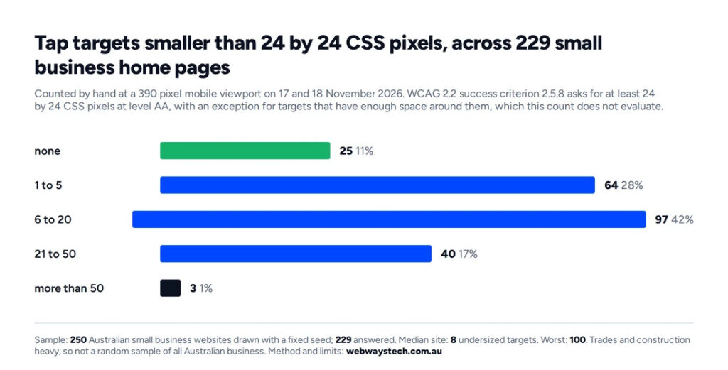
How many tap targets under 24 by 24 CSS pixels each site carried at mobile width, across 229 Australian small business home pages, 17 and 18 November 2026.
The new success criterion that fails almost everywhere
204 of 229 sites had at least one tap target smaller than 24 by 24 CSS pixels. That is 89%. The median site had 8 of them, 43 sites had 21 or more, and the worst had 100. Only 25 sites had none.
The offenders repeat from site to site, and they are not exotic:
- slider dots at 10 by 10 pixels, often 5 or 6 of them in a row
- slider arrows at 20 by 20
- social icons in the footer
- phone numbers rendered as links 15 to 19 pixels high
- small text links such as ‘Click here to view our service area’, 20 pixels high
Here is the part worth sitting with. The automated pass flagged its own target-size rule on 27 sites. The manual pass at mobile width found undersized targets on 204. Same standard, same sites, one order of magnitude apart, because the scanner only reports the cases it can resolve confidently. If you have run a free scanner and seen a short list, that is what you were looking at.
The older failures that are still everywhere
The automated pass is not evenly spread across the standard. It concentrates in a handful of rules.
| What axe flagged | Sites affected | Share of 229 | Total instances |
|---|---|---|---|
| Colour contrast | 151 | 66% | 1,757 |
| Links without an accessible name | 79 | 34% | 380 |
| Images without alt text | 29 | 13% | 142 |
| Target size, automated part | 27 | 12% | 187 |
| Links not distinguishable in text | 22 | 10% | 63 |
| Frames without a title | 20 | 9% | 22 |
| Prohibited ARIA attributes | 16 | 7% | 65 |
| Viewport that blocks zooming | 16 | 7% | 16 |
| Images with a role but no label | 10 | 4% | 63 |
Colour contrast is the whole game. It is the visual presentation of text, and 2 thirds of the sample fails it, and where it appears the median site carries 7 failing elements, while the worst carries 95. It is usually one brand colour used for body text or button labels, repeated everywhere by the theme.
Links without an accessible name are a third of the sample. That is the icon link with no text and no label: a screen reader announces ‘link’, and nothing else.
Across the whole sample, 200 sites of 229 had at least one automated violation. The median site had 8 and the worst had 97. 29 sites came back clean.
Three lines of markup, and the one site that passed everything
3 cheap things are worth checking on your own site before anything else: the declared language, the heading structure and the viewport.
- No page language at all: 8 sites, 3%. Criterion 3.1.1 Language of Page sits at level A, and without it a screen reader guesses the accent to read your page in.
- Headings: 141 sites have exactly one H1. 50 sites, 22%, have none at all, and 38 sites, 17%, have more than one.
- Viewport: 5 sites, 2%, ship no viewport meta, and 16 set one that blocks zooming.
- Images without alt text appear on 57 sites, 25%, with one page carrying 50 of them.
- Text below the legibility threshold appears on 66 sites, 29%.
A curiosity rather than a failure: 52 of the Australian businesses in the sample declare their page language as en-US. It is a theme default nobody changed, and it costs nothing to fix.
Now the number that made us check the script twice. Take the 4 checks this article has used so far: a clean automated scan, no undersized targets, exactly one H1, and a declared page language. Exactly 1 site of the 229 passed all 4.
Who each of these failures actually blocks
Numbers like that go numb quickly, so it is worth naming which people with disabilities each failure stops, and on which part of the web page.
A target under 24 pixels blocks someone whose hands shake, someone using a phone on a bus, someone with large fingers and a small screen. They do not get an error message. The tap simply lands somewhere else, and the third time it happens they leave.
A link without an accessible name blocks someone using a screen reader. The page reads out ‘link, link, link’ and there is nothing to choose between them. This is the 34% above.
Weak contrast blocks someone with low vision, someone over 60, and anyone reading outdoors in Australian sun. This is the 66%.
A missing H1, or a page full of them, blocks anyone who navigates by headings instead of scrolling. That is how screen reader users move through a page quickly.
None of this needs a persona to make it real. When we audit a client site we publish the findings in full rather than summarising them, because the list is the useful part.
What is an hour, what is a theme setting, what is a rebuild
Improving accessibility on a site like these is not one job, and most of what we measured sorts into 3 buckets.
An hour, by the owner. Alt text on images that carry meaning. Link text that says where the link goes instead of ‘read more’. The page language attribute, if your platform exposes it. These are content edits, and they are the fastest accessibility work there is.
One change by a developer, applied site wide. Colour contrast is almost always a token: one brand colour used for text at a weight and size that fails. Fix it in the theme and 1,757 instances across a sample like ours become a handful. Target sizes on standard buttons and menu items are the same kind of fix, as is the viewport meta that blocks zooming.
A rebuild, or at least a new component. Slider widgets with 10 pixel dots, image carousels that only respond to dragging, and layouts where the heading structure follows the visual design rather than the content. These are decisions baked into the build, and in our experience they are the ones that survive every attempt to patch them from the outside. If the third bucket is where your list sits, that is a build conversation rather than a plugin one: it is WordPress design and build work territory.
Why an overlay does not close these lines
Accessibility overlays, the one-line scripts that add a floating button with contrast and font size controls, are sold as a fix for exactly this situation. Test them against the list we measured.
Undersized targets: unchanged, because the overlay does not resize your slider dots. Links without an accessible name: unchanged, because the overlay cannot invent the name. Images without alt text: unchanged. Heading structure: unchanged. Contrast: changed only for the visitor who finds the widget, opens it and switches a mode on. That is not the same as the page being readable.
To be fair to them, overlays do give a visitor controls they would otherwise set in the browser or the operating system. Some people use them. What they do not do is change anything in the page that the measurement above is counting.
Questions we get asked
Does my small business website have to meet WCAG 2.2? WCAG is a W3C standard, not a law in itself. Australian government guidance points at it for public-facing digital services, and many contracts and tenders name it. Whether it binds your business is a legal question, and this article does not answer it.
What is actually new in WCAG 2.2? 9 success criteria were added to 2.1 and 4.1.1 Parsing was removed. The 4 that reach an ordinary brochure site are focus not being obscured, dragging alternatives, target size at 24 by 24 CSS pixels, and help that appears in a consistent order.
How do I check my own site? Run a free automated scanner for the machine-checkable part, then read that tool’s documentation on what it does not test. Then open the site on a phone and tap the small things. In our sample the scanner found target size problems on 27 sites and the manual pass found them on 204.
Do accessibility overlays fix this? Not the findings in this measurement. Undersized targets, missing link names, missing alt text and heading structure all sit in the page itself. An overlay adds controls on top of the page.
Where should a small business start? Page language and H1 first, because they take minutes. Then contrast, because it is usually one colour token and it affects the most people. Then tap targets on mobile.
What this means in Australia, and what it does not
WCAG itself is a W3C standard for web content accessibility and reads the same everywhere, which is why digital accessibility guidance in different countries keeps pointing back at it. In Australia, the government’s own guidance points at it. The Style Manual sets out what accessible and inclusive content means for government publishing. The Digital Service Standard sets the criteria that government digital services are measured against.
What this article does not do is tell you your legal exposure. That is a question for a lawyer who knows your sector. The Australian Human Rights Commission guidance we wanted to read for this piece did not load when we wrote it, and we are not quoting it second hand.
You do not need to read the whole standard to use WCAG. 3 things are worth doing this week, in this order:
- View your home page source and check 2 lines:
<html lang=...>and your H1. That is 5 minutes and it fixes 2 of the 4 checks above. - Run any free scanner you like, then read its own documentation on what it does not test. The gap between 27 and 204 in our sample is that documentation in numbers.
- Open your site on a phone and try to tap every small thing on the home page with one thumb, honestly. The slider dots are usually the first thing you miss.
Vasilii Aldukhov founded Web Ways Tech in Sydney and has built websites for ten years, mostly in WordPress. He works with Australian businesses on rebuilds, ecommerce and the search foundations underneath them.